If you have ever uploaded a beautiful featured image only to see it chopped off in the Divi Blog Module, you already know how frustrating this is. Square images lose their sides. Portrait images lose their top and bottom. Group photos lose faces. The usual fix floating around the internet, a PHP snippet that forces the crop size to 9999px, is built for Divi 4. It still works in many cases, but it means editing your child theme’s functions.php file, and it gives you no real control over how the image frames itself once cropping is removed.
Divi 5 now solves part of this properly, with native Aspect Ratio and Image Framing settings. I say “part of this” deliberately. While testing this on my own Blog Module, I found that one piece of it, the setting that controls which part of the image stays visible after cropping, does not currently work the way it is documented to. I will walk through exactly what works, what does not, and how to get full control either way.
Why Divi Crops Your Featured Images in the First Place
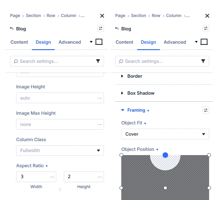
When you add a featured image to a post, Divi generates a smaller version of it to use inside the Blog Module’s grid and slider layouts. By default, this thumbnail is 400 by 250 pixels, close to a 16:10 ratio. If your original image does not share that exact ratio, Divi crops it to fit. A square image gets its left and right edges trimmed. A tall portrait image loses even more. This is normal WordPress and Divi behavior, not a bug, but it rarely looks good when your uploads do not all match one fixed ratio.
In Divi 4, the only way around this was to intercept the image size with PHP, stop Divi from cropping at all, and then handle the framing yourself with CSS. Divi 5.5 and later gives you direct control over the ratio and the crop fit right inside the builder. Note that this requires Divi 5.5 or later. If your Design tab does not show an Aspect Ratio field at all under Sizing, an update to the latest Divi version should bring it in.
Method 1: Aspect Ratio and Object Fit (Divi 5.5+)
Where to find this setting: Open the Blog Module, go to the Design tab, then Image, then Sizing, and look for Aspect Ratio. Because the featured image is a sub-element of the Blog Module rather than a standalone Image module, this setting sits a level deeper than it would on a plain Image module, under Design > Image rather than directly under Design.
Elegant Themes’ own documentation recommends a 3:2 ratio for blog featured images, which is a good starting point and what I used in my own testing. Other common choices:
- 3:2, the documented default for blog cards
- 1:1 for square cards
- 4:3 for a slightly taller card
- 16:9 for a wide, landscape style card
Setting an aspect ratio on its own can stretch or distort the image to fill that shape. That is what Object Fit is for.
Where to find this setting: Still under Design > Image, look for the Framing option group, just below Sizing.
Set Object Fit to Cover. This is the setting that actually matters, and I want to be specific about why, because the default option, Fill, looks deceptively similar in the dropdown but produces a different result. Fill stretches the image to match the frame exactly, distorting it. Cover scales the image to fill the frame while keeping its proportions intact, cropping whatever does not fit instead of stretching it. If you accidentally leave this on Fill, your images will look stretched rather than cropped, which is a common point of confusion. Make sure it is explicitly set to Cover.
With Aspect Ratio set to 3:2 and Object Fit set to Cover, this is confirmed working correctly, in both the builder preview and on the live frontend.
Where This Breaks Down: Object Position
Next to Object Fit, Divi 5 also gives you an Object Position control, a small draggable grid that is supposed to let you choose which part of the image stays visible once Cover crops it. In testing, this control did not work on the Blog Module’s featured image. Dragging the focal point to a different position produced no visible change at all, in the builder or on the frontend, and inspecting the generated CSS showed why: the object-position property was being output as a fixed 0% 0% no matter where the control was set, which pins the crop to the top left corner regardless of what you choose.
I tested the same Object Position control on a standalone Image module on the same site, and there it worked correctly. So this appears to be specific to the Blog Module’s featured image element, not a site-wide issue or a general Divi 5 problem.
Whether this matters to you depends entirely on what your featured images look like:
- Photos and scenery: if your featured images are regular photographs, like a product shot, a landscape, or a general lifestyle image, a centered crop from Cover is usually fine. Losing a bit of the edges rarely changes what the image communicates. This is also Elegant Themes’ own documented default, 3:2, Cover, centered focal point, so most sites following their guidance will not run into this at all.
- Text and graphic heavy thumbnails: if your featured images are designed graphics with a headline, icons, or other detail placed off center, like the “How To” style banner thumbnails I use on this site, a centered crop can cut into exactly the part of the image that matters. This is where the missing Object Position control becomes a real limitation, since there is currently no way to shift the focal point for this element through the builder interface.
If your thumbnails fall into that second group, you have two practical options.
Option A: Design the source image with the focal content already centered
Since the crop will default to center regardless of what you set in the builder, the simplest fix is to build your thumbnail graphics so the important content, headline, icons, key visual, already sits within the center region that a 3:2 Cover crop will keep. This avoids the bug entirely and needs no code.
Option B: Set the crop through Custom CSS instead
Both the classic Blog Module and the Loop element give the Featured Image its own scoped Custom CSS field, separate from the rest of the module, under the Advanced tab. Setting object-position here does work, since it bypasses whatever is causing the builder’s Object Position control to fail.
Where to find this setting: Open the Blog Module, go to the Advanced tab, find Featured Image in the list of elements, and open its Custom CSS field.
object-fit: cover;
object-position: top;
height: 135px;
A real limitation to know about before you rely on this: the height value here is a fixed pixel number, and your blog grid’s image height will usually change across screen sizes, since most Divi layouts use a percentage based column width, which makes the rendered image height change too, even though the CSS height is fixed. A height that looks correct on desktop may be too tall or too short on tablet or mobile. If you use this method, check your layout at a few breakpoints and adjust the height value for each one using Divi’s responsive editing, rather than setting a single height and assuming it holds everywhere.
This is also a reasonable point to mention: setting object-position through CSS does not require you to also use Divi’s native Aspect Ratio setting. You can achieve the entire crop, ratio and position together, through this Custom CSS field alone, which is also why this method works as a full fallback for anyone on a Divi version older than 5.5, not just as a fix for the Object Position bug.
Still on Divi 4? Neither method above is available on Divi 4. If you have not upgraded yet, the established fix is a PHP snippet in your child theme’s functions.php file. Add the following:
function wpc_remove_height_cropping($height) {
    return '9999';
}
function wpc_remove_width_cropping($width) {
    return '9999';
}
add_filter( 'et_pb_blog_image_height', 'wpc_remove_height_cropping' );
add_filter( 'et_pb_blog_image_width', 'wpc_remove_width_cropping' );
This tells Divi to stop generating a cropped thumbnail and instead use the original image size. Keep in mind this only stops the cropping, it does not give you control over aspect ratio or framing, so your blog cards may end up uneven heights unless your featured images already share similar proportions. You may also need to install the Regenerate Thumbnails plugin afterward so existing images update to the new size.
Frequently Asked Questions
Does this fix work on existing posts, or only new ones?
Both methods apply at the module or template level, not to individual images, so they take effect immediately on every post shown in that Blog Module or Loop layout, including posts you already published. You do not need to re-upload or re-crop any existing featured images.
Why doesn’t moving the Object Position dot change anything?
On the Blog Module’s featured image element specifically, the Object Position control does not currently pass its value through to the generated CSS, so moving it has no visible effect. It outputs a fixed top left position regardless of what is selected. This did not occur when the same setting was tested on a standalone Image module, so it appears limited to this one element. Setting object-position manually through the element’s Custom CSS field works as a reliable alternative.
Will this slow down my site or affect Core Web Vitals?
No. Both the native settings and the CSS fallback rely on standard CSS properties and do not add extra image requests or increase file size. Your actual image file size and dimensions still matter for load speed, so it is still worth compressing images before upload regardless of which method you use.
Why does the CSS fallback need a height value, and is one value enough for all screen sizes?
Object-fit only has a visible effect when there is a defined height for it to fill. A single fixed height usually will not look correct across every screen size, since the image’s rendered height often changes with column width on smaller screens even though the CSS height does not. Checking the layout at each breakpoint and adjusting the height value accordingly gives a more consistent result than relying on one fixed number everywhere.