
I’ve built well over a hundred landing pages in WordPress and Divi over the past several years — for service businesses, SaaS trials, webinar signups, and lead-gen funnels. Most of the “landing page conversion optimization” advice you’ll find online is written by conversion copywriters or growth marketers who’ve never opened a page builder. It’s not wrong, exactly, but it skips the part where the design actually gets built — and that’s where conversion rates are won or lost.
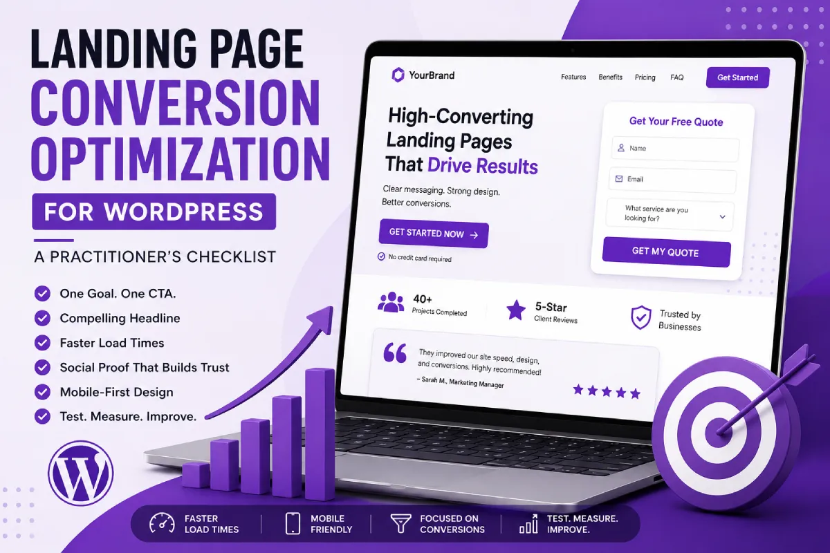
This is the checklist I actually run through when I build or audit a landing page, in the order I run through it.
1. One Page, One Goal, One CTA
This is the single most common mistake I see on client sites: a landing page with a contact form and a phone number and a “download our brochure” link and a newsletter signup, all competing for attention. Every one of those is a legitimate conversion goal — but not on the same page.
Before I open the page builder, I write down exactly one sentence: “This page exists to get the visitor to ___.” Every section on the page has to serve that sentence. If it doesn’t, it comes off the page — including main navigation. I strip the header nav on true landing pages built for paid traffic or email campaigns; internal links back to the blog or homepage are just exit ramps you built yourself.
2. The Hero Section Has About Three Seconds
Your headline needs to answer two things immediately: what you offer, and why it matters to the person reading it. I write headlines around the visitor’s problem, not my client’s product name. “WordPress Site Running Slow?” outperforms “Introducing Our Speed Optimization Service” every time I’ve tested it, because it mirrors the search intent or ad copy that got them there in the first place.
Below the headline, one supporting sentence and a visible CTA — no scrolling required to see the button. On mobile that means the CTA needs to survive above the fold on a 375px viewport, not just a 1440px desktop preview.
3. Cut Your Form Down to the Bone
Every additional form field is a small excuse to leave. I default to name, email, and one qualifying field (like “what service are you looking for”) — nothing more, unless the sales team genuinely can’t work a lead without it. If you need more information later, get it in a follow-up call or email sequence, not on the landing page.
In Divi, I build forms with the Contact Form module rather than embedding a heavier third-party form plugin unless the client needs CRM integration — fewer scripts loading means less to slow the page down, which matters more than people think (more on that below).
4. Put Social Proof Right Next to the CTA
Testimonials, client logos, review counts, or case study numbers work best when they sit directly beside or just below the button — not buried in a separate section further down the page. The visitor’s hesitation happens at the moment they’re about to click, so that’s where reassurance needs to live, not three scrolls away.
A single specific number (“Helped 40+ WordPress sites recover Core Web Vitals scores”) does more work than a vague claim (“Trusted by businesses everywhere”). Specificity reads as credible; generic claims read as marketing copy.
5. Page Speed Is a Conversion Metric, Not Just an SEO One
This is the part most CRO advice skips entirely, and it’s where my technical SEO background actually changes the outcome. A landing page loaded with page-builder animations, background video, and five different tracking scripts might look polished in the editor — and then take four seconds to become interactive on a real mobile connection. Every extra second of load time is visitors leaving before they ever see your CTA.
My standard build checklist for landing pages specifically:
- No background video on the hero — use a compressed static image or lightweight CSS gradient instead
- Limit animated entrance effects to one, maybe two elements — not every module on the page
- Lazy-load anything below the fold
- Audit third-party scripts (chat widgets, pixel trackers, popup tools) — each one is a render-blocking risk
- Run the page through PageSpeed Insights before launch, not after the client complains about lead volume
If you haven’t already, it’s worth reading through my WordPress speed optimization guide — most of it applies directly to landing pages, often more urgently, since landing pages usually carry paid traffic where every second of delay has a direct cost.
“On slower mobile connections, I’ve seen form submissions drop noticeably once load time crosses ~3 seconds.”
6. Design for the Thumb, Not the Mouse
Most landing page traffic — especially from paid social and email — arrives on mobile. I test every landing page build on an actual phone before launch, not just the responsive preview in the builder. Specific things I check:
- CTA button is large enough to tap without zooming (44px minimum touch target)
- Form fields don’t trigger the wrong mobile keyboard (email field should trigger the @ keyboard, phone field the numeric pad)
- Sticky CTA bar for long-scroll pages, so the button is always reachable
- No hover-dependent interactions — anything that only reveals on hover is invisible on mobile
7. Test One Change at a Time
Once a page is live and getting traffic, resist the urge to redesign the whole thing based on a gut feeling. Change one variable — headline, CTA copy, form length, hero image — run the test long enough to get a meaningful sample, then move to the next variable. If you change five things at once and conversions go up, you won’t know which change actually did the work.
This works best when traffic is consistent — on very low-traffic pages, you’ll need longer test periods.
For most small-to-mid traffic sites, a full A/B testing platform is overkill. I’ve had good results just alternating design versions manually on a schedule and comparing Google Analytics conversion events for each period — not statistically perfect, but good enough to catch big wins and losses.
Landing Page Build Checklist (Step-by-Step)
When I’m building a new landing page in Divi from scratch, this is the sequence:
- Define the single conversion goal and write the one-sentence purpose statement
- Draft headline and hero copy before touching the builder
- Wireframe section order: hero → problem/benefit → social proof → objection handling → final CTA
- Build mobile-first, then adapt up to desktop breakpoints
- Strip global header/footer navigation if this is a dedicated campaign landing page
- Add tracking (GA4 events, not just pageviews) before launch, not after
- Run a speed test and mobile tap-target check as the final QA step
Frequently Asked Questions
What is landing page conversion optimization?
Landing page conversion optimization is the process of improving a page’s design, copy, and technical performance so a higher percentage of visitors complete the intended action — filling out a form, booking a call, or making a purchase.
How many CTAs should a landing page have?
One primary conversion goal, though the same CTA can repeat at multiple points down the page (hero, mid-page, and final section) as long as it always points to the same action.
Does page speed actually affect landing page conversions?
Yes — slow-loading pages lose visitors before the CTA is ever seen, especially on mobile and paid traffic where every second of delay increases the chance of an abandoned visit.
Should I use a page builder like Divi for landing pages?
Page builders work well for landing pages as long as you keep the build lightweight — avoid stacking heavy animations, background video, and unnecessary third-party scripts that slow the page down.
How often should I run A/B tests on a landing page?
Test one variable at a time and run each test long enough to reach a meaningful sample size before drawing conclusions — rushing to the next test too early leads to false signals.
What makes a high-converting landing page?
A high-converting landing page is focused and distraction-free, with a clear headline, one primary goal, and a visible call-to-action. Strong social proof, simple forms, and fast load times all help increase conversions.
Should landing pages have navigation menus?
Usually no — especially for paid campaigns. Navigation menus can distract users and reduce conversions. For organic pages, a minimal menu can be included if it doesn’t take attention away from the main action.
Need a landing page that actually brings in leads — not just traffic?